Over at WattsUpWithThat there is a fascinating post about the adjustments done to the raw data at Darwin, Australia.
I was curious to see whether the newly relased HADCRU data also contained Darwin and if so how that version compared to the ones in that post. So I downloaded the data and unzipped it. Then I used John Graham-Cumming's handy google map (last page) to identify the station, checked that it was somewhere sensible - it is a rounding error away from Darwin Airport which is promising - and did some data parsing.
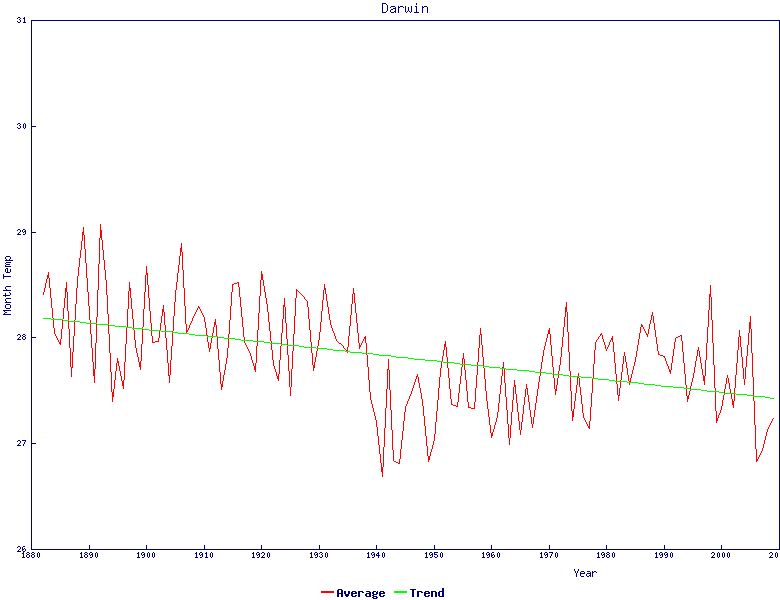
What I got is this graph: which looks to me to be identical to the raw data in Willis' figure 7. This is helpful as it tells us something about the level of "value add" in the HADCRU raw data - and the good news is that it looks like there isn't a great deal of adjustment - at least for GHCN stations - from the raw data.
I suspect that HADCRU and the met office are going to regret their data openness. Because we'll be able to do all sorts of plotting and going on this and on the similar New Zealand data I expect that the graphs we get won't look anything like as warm as the ones they get,


 Blog Home : December 2009 : Permalink