[Note this article is an attempt at a non-staistical explanation of work done by Steve McIntyre (especially here, here and here) and Ross McKitrick, all credit belongs there not here - Update (29 Sept) The key final graph has been updated by Steve since I wrote this piece originally, in changing the graph I have also taken the time to fix a few typos and made a few other minor changes] Introduction As I write this a selection of terribly self-important folks are partaking of coffee amongst the dreaming spires of Oxford and preparing to discuss what might will happen when the earth heats up by 4°c. This includes a couple of folk from the Hadley Center who are getting a certain amount of coverage in the press for their sky is falling predictions.
Now all of this is discussion is clearly intended to influence the politicians who are going to show for the UN meeting in Copenhagen and all of it makes the assumption that the earth is heating up rapidly, indeed exponentially rapidly, which is interesting when you look at the data upon which this panic is built.
One of the major drivers of the thesis that Human derived CO2 is causing unsustainable climate change has been the notorious "hockey stick" graph popularized by various UN reports, Al Gore and so on and which originated in Mann, M.E., Bradley, R.S. and Hughes, M.K., 1998. “Global-Scale Temperature Patterns and Climate Forcing Over the Past Six Centuries”, Nature, 392, 779-787 (aka MBH98) and related papers such as the sequel Mann, M.E., Bradley, R.S. and Hughes, M.K., “Northern Hemisphere Temperatures During the Past Millennium: Inferences, Uncertainties, and Limitations”, Geophysical Research Letters, 26, 759-762, 1999 (aka MBH99). These papers, and many other papers by various climate scientists, were based in full or in part on temperature reconstructions derived from analysis using tree-rings widths as a proxy for temperature. The basic theory (and I simplify drastically here) being that trees grow faster in hotter years than in cooler ones and thus that wider rings mean warmer years etc.
How to Create Tree Ring Chronologies The challenge for creating really long tree-ring records is that there are very few 500+ let alone 1000 year old trees so researchers like to find places where there are lots of fossil or near-fossil dead trees together with a few live ones. Then they sample the trees (live and dead) to get the rings and do some cunning analysis to map the various sequences together. They may (not sure) also use radiocarbon or similar dating techniques to help sort out approximate ages.
At the end of this you have a proxy for an annual average (summer) temperature over a few centuries based on stitching together the data of numerous trees which were only alive for a portion of the time. You may have perhaps 250 - 500 total trees in your sample but at any one date the ones that were alive may vary between a high of say 60 and as low as perhaps 10. Clearly the more trees you have for a particular time period the less likely you are to be misled by one or two trees being outliers who then skew the series one way or the other. What do I mean? well say a storm comes through and knocks down a couple of big trees south of the one you are sampling then for the few years after that storm that tree is going to receive more sunlight and rain than it did before when it had other trees around it. Hence during those years it is likely to have thicker rings than it did before even if the actual temperatures were the same. Although storms are likely to affect the entire region there is a good chance that other trees that are alive at that time will not be as affected by the storm and thus they will not experience such a spurt. If you only have half a dozen trees then the outlier with the growth spurt is going to be far more influential than it would be in a group of 50.
Another challenge is that of course one won't always find enough sample trees in the same place. Clearly the ideal is that we find hundreds of trees of various ages submerged in a lake or bog with another hundred alive and next to it. In practice one has to merge together trees found in fairly close proximity where "proximity" may mean a few tens of kilometers apart. In particular for fossil trees that have been washed down rivers to end up in lakes/bogs it can be hard to be completely sure of the original location and thus ensure that the trees used have experienced the same climate, but with care it is possible to ensure that the trees grew up close enough for the analysis to make sense.
The Polar Ural Controversy It turns out that some tree ring chronologies that have been quite popular and influential in the hockey stick papers and in other ones are a sequence that originate in the frosty northern wastes of Siberia.
The first version of a chronology using records from this area - published in 1995 by Briffa, Schweingruber & co in "Nature" reported that 1032 was the coldest year of the millennium - right in the middle of the Medieval Warm Period. But the reconstruction depended on 3 short tree ring cores from the Polar Urals whose dating was very problematic.
In Briffa 2000 a second series called "Yamal" was used that seemed to be less questionable (i.e. had more than 3 trees). It used data from just one place (Yamal) as opposed to being spread out which implied it would be better and amazingly it showed both a distinct hockey stick in the 20th century and a lack of a medieval warming period. Hence it was reused in many other papers by lots of climatologists who liked the idea of hockey sticks. However an updated analysis by Esper in 2002 of the original 1995 paper using data from a lot more sites in the Polar Urals failed to show anything like the same effect. Unfortunately since Briffa failed until very recently to actually make his raw data available it was impossible for a third party to reproduce his result or figure out whether it was "robust" to use a word much beloved by climate scientists (Esper was also pretty reticent but finally produced his data in 2006). Fortunately he has now done so and Steve M has been on it like a bloodhound on a raw steak. It should be noted that as well as Briffa and Esper, another analysis of tree rings in much the same place exists. This (Hantemirov and Shiyatov) uses a different method of age standardization and produces a more Esper like graph although it appears to use much the same raw data as Briffa's.
How many cores? As noted in the "How to" section, the question boils down to choosing which samples to include and which to skip. The H&S study uses a relatively small number of large (and hence long-lived) trees so that although the chronologies are made up of between 10 and 20 trees mostly (less than 10 for 1500 years and older) there is some sort of consistency - although the low number does lead one to question things.
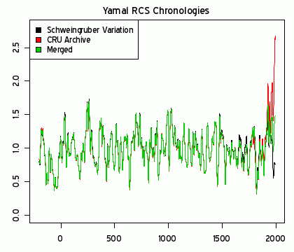
For the Briffa Yamal series, the number varies more widely in more modern times (the count seems almost identical in the pre 700AD area) with up to 40 around 1750 and a significant drop off to 12 in the 20th century. Given that the 20th century is where we see the dramatic uptick one might wonder whether there is a little cherry picking going on here. This seems particularly striking when the Esper chronology has over 50 cores throughout the 20th century.
The Taymir Divergence Diversion Another dataset that has been widely used from the same Briffa 2000 paper is the Taymir set. Unlike the Yamal chronology Taymir shows signficiant cooling in the latter half of the 20th century. This is called a divergence problem, but despite the post 1950 problems it too has been widely used in other multi-proxy temperature calculations. However while Yamal has not been updated (by Briffa) since 2000, in 2008 when he republished Yamal he produced a new improved "Taymir" called Avam-Taymir. This new set, Steve discovered, combined samples at Taymir with ones from Avam some 200 miles distant and from another site Balschaya Kamenka 60 miles (100km) from Avam sort of on the way to Taymir (see triangle in the accompanying google map) Notably the combined series ignored two or three sites closer to Taymir sampled by Briffa's erstwhile collaborater Schweingruber even though it was he who obtained the Balschaya Kamenka samples. Fortunately for the hockeystickophiles the new combined Avam Taymir set both removes the awkward late 20th century divergence problem and the medieval warm period. Given this feliciticious result it seems mean to point out that there are other Schweingruber sites far closer to Taymir and that Avam, at least as depicted in Google Maps, appears to have a very different terrain to the other two (it's in a valley whereas the other two are on flatter tundra, implying that it might well have a different climate).
Back to Yamal The Yamal archive has 12 cores for the 20th century period, which as noted above, is not terribly many given that in earlier times we see 40. However fortune smiles upon the investigator who wishes to update Yamal because Schweingruber also sampled an area slap bang in the middle of the Yamal area as defined by H&S (the pink square and point in the accompanying google map). This sample is of 34 live trees and would therefore significantly improve the coverage of the 20th century. Steve therefore decided to see what would happen if he a) replaced the 12 previous Yamal 20th century cores with the 34 or b) simply added them. The resuts of his experiments can be seen below: note this graph updated from original The black line is case a) above, the green line case b). Below is a close up of the last 200 years or so to make the difference really clear:
Summary and Implications What this boils down to is to show that obtaining exciting hockey stick graphs appears to depend on the tree ring samples used. There may be reasons why researchers might use one set of samples over another but without some clear justification a skeptic who looks at the results will tend to suspect that the motivation for choosing which sets to include in a chronology is based on whether it indicates a warming pattern or not. This skepticism is increased by the fact that the raw data and algorithms used to produce these graphs is only released to the general community after a lot of effort as it implies that the authors have something to hide.
Furthermore (note this is my view not Steve M's) given that the world is being pressured to introduce all manner of CO2 reduction schemes which are likely to severely impact the global economy, the secretiveness could well lead the world's leaders to make decisions that are needlessly harmful. When it comes to other areas of the global economy - pharmaceutical trials or the spread of epidemics for example or the disclosures required for financial instruments and company flotations - it is expected that the raw data will be provided so that others can attempt to verify the claims made. In the pharmaceutical world this often leads to dramatic changes of advice (recall the post menopausal hormone replacement therapy brouhaha) as further analysis indicates that the original science was wrong. If global warming is not a scam then the scientists who make the predictions ought to welcome others trying to replicate and then improve their analyses.
Contrariwise, if it should turn out that the 4°c folks are right then by not allowing others to reproduce their results the warners are missing a major way to build up support for their position from other scientists, mathematicians, engineers and so on.
 Blog Home : September 2009 : Permalink
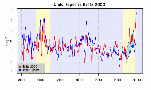

